If you’re perusing this portfolio and know me as an author, you might recognize the book title in this portfolio entry as the title of my book.
Yes, I designed my own cover. Sort of kind of on accident. This post will be both portfolio samples and story.
My publisher, Jill McCabe Johnson of Wandering Aengus Press, offered me the option to design my own interior when the press acquired my manuscript. Jill knew I’d done some interior work for Ooligan Press, and also looked at the samples that were currently on this digital portfolio. I said yes immediately, as interior book design might be my happiest place in the publishing process and I wanted the creative control over how my book would look.
So, I was always going to design my interior (read about the process and see samples here). I never imagined I’d design my cover.
Then, last spring, I took the final book design class in my grad program in Book Publishing, Advanced Book Design. We each had to pick a book early in the term as our Main Book Project, either something in the public domain or something we had the rights to. Since I knew I’d be designing my interior, I asked the professor, Elaine Schumacher (she’s amazing), if I could just use my own book manuscript. She said yes.
That meant I had to design a lot of covers for it.
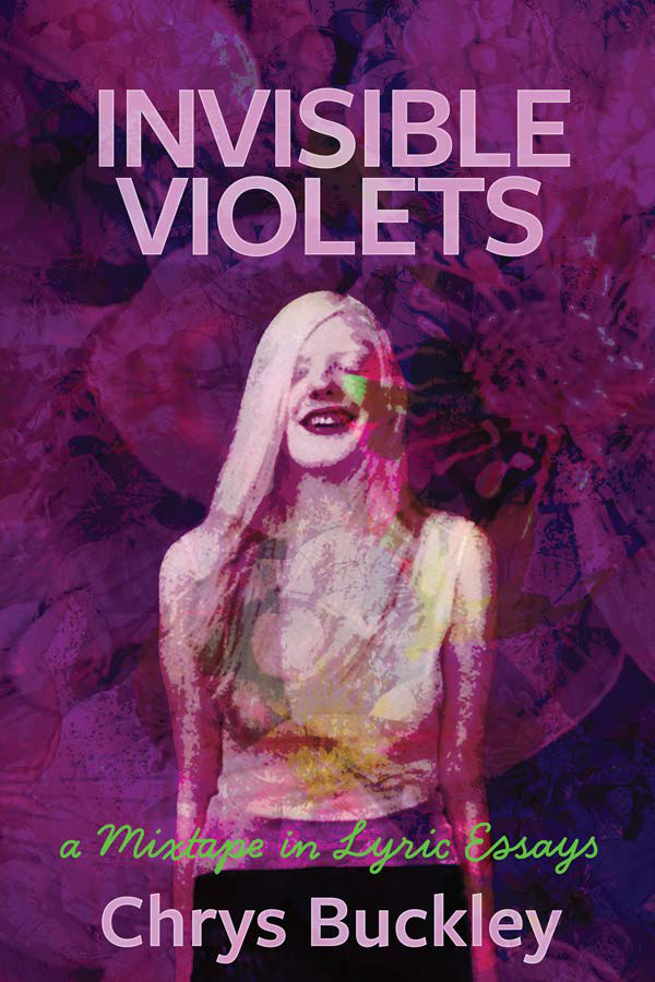
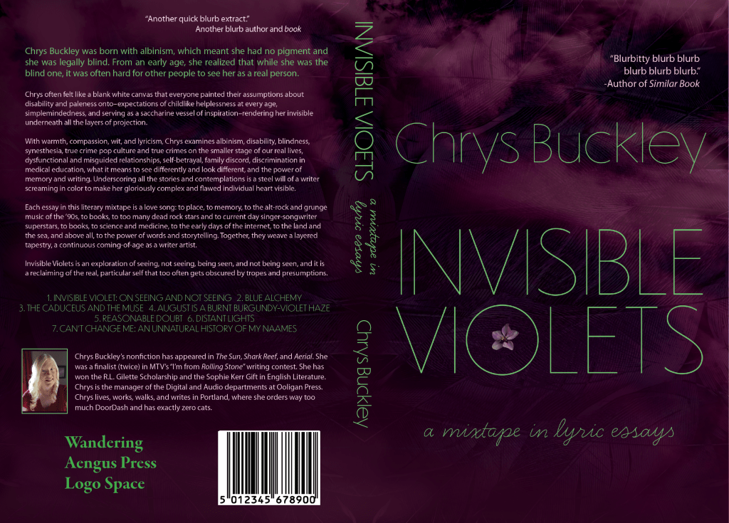
First were the image-based covers. From three mocked-up concepts, I had to develop one into a full jacket. For this one, I was sort of going for something that looked like an album cover. The picture of me was taken by Rick Guidotti of Positive Exposure. (He’s in the book, too.)
Here is the image-based cover and full jacket:
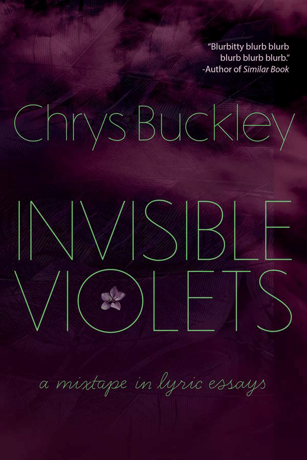
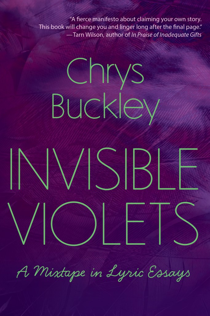
Then we went through the same process, but with typographic covers. We each came up with three concept mock-ups. From there, we had to develop one into a full jacket. This was less familiar territory for me, and just came from playing around with textures in Photoshop, using the tools I was learning in the class.
Here’s the cover and full jacket for the typographic cover:
While I was taking the class, Jill asked about ideas for cover designs, and I said I was having to design some for my grad program anyway, so I’d send her them when I was done. She could then see if she wanted to use either of them, or scrap both and start from scratch. Full disclosure: I expected her to scrap both. I’ve never thought of myself as a cover designer, even though I’ve had to do it for several classes, as evidenced throughout this portfolio.
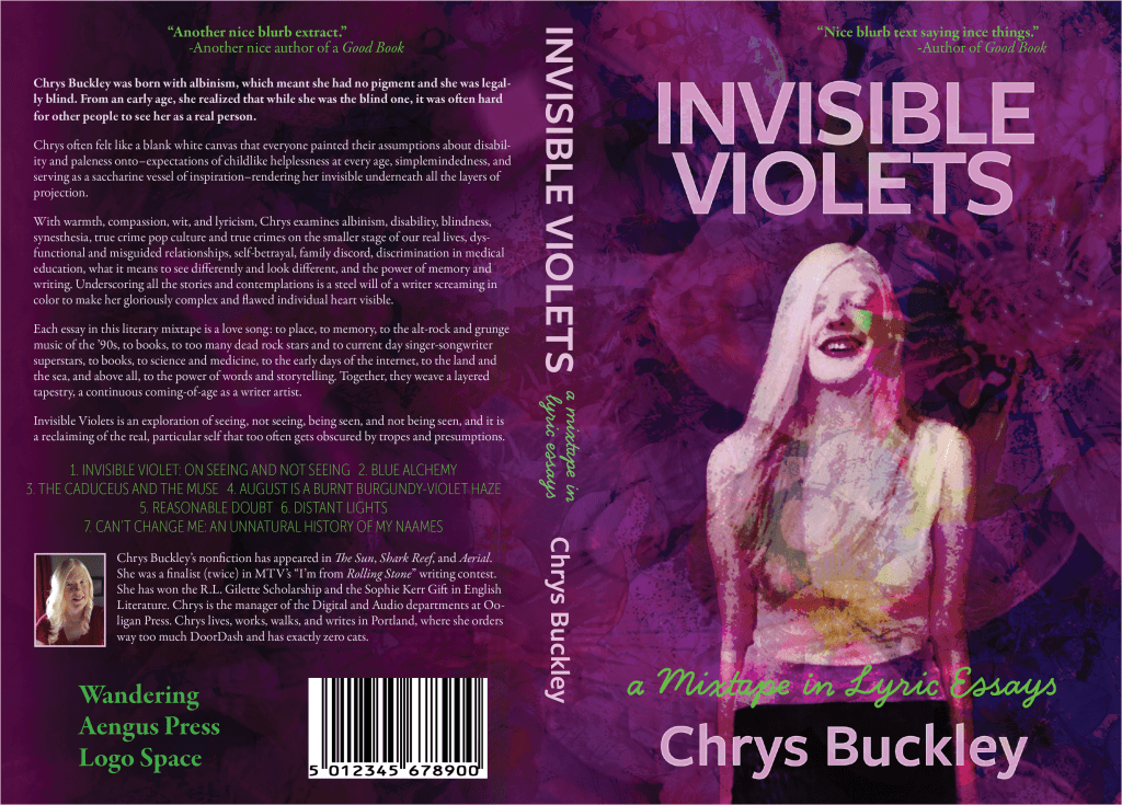
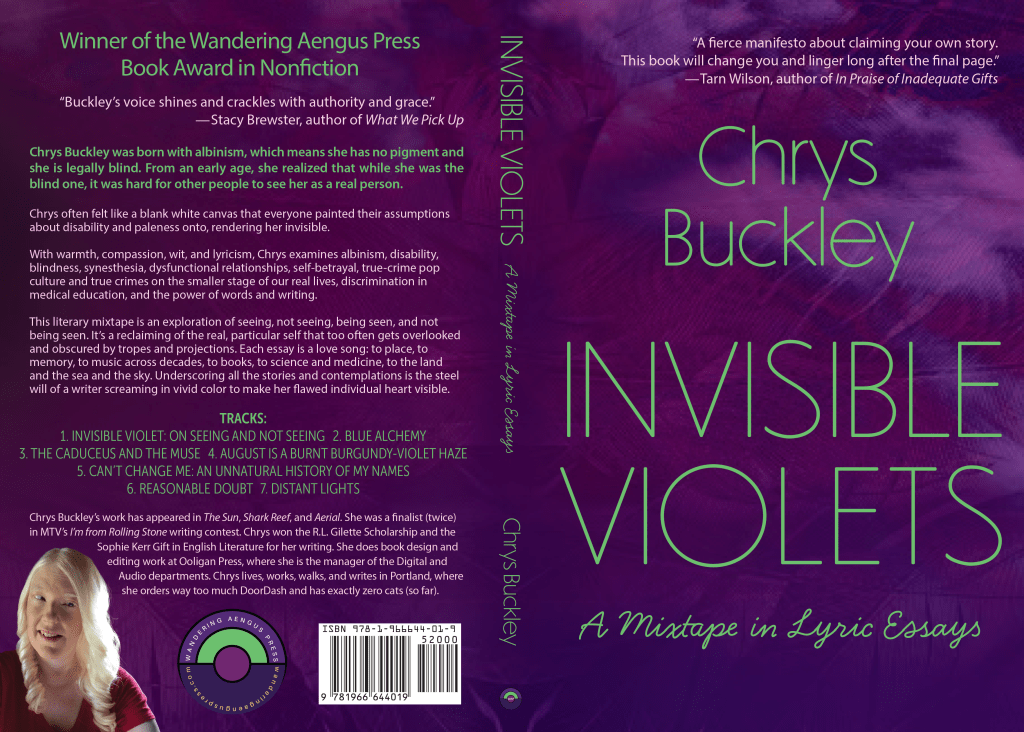
Jill chose to go with the typographic cover. Based on her feedback, as well as some lessons learned from printing a test copy (a requirement for the Advanced Book Design course), I made lots of adjustments and tweaks. Then, of course, we also swapped out real blurbs for my placeholders, and added the actual Wandering Aengus Press logos and real bar code.
Here is the final cover and jacket, what ended up on the actual book:
What this all means is that now my cover is the part of my book I feel the most insecure about. I’ve gotten a lot of compliments on it, though, mostly from people who have no idea I designed it myself. And my publisher wants me to do some jacket work for their press. And I like my cover, even when I feel insecure about how inexperienced a cover designer I am, so there’s also that.
