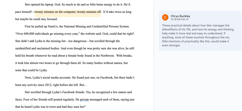
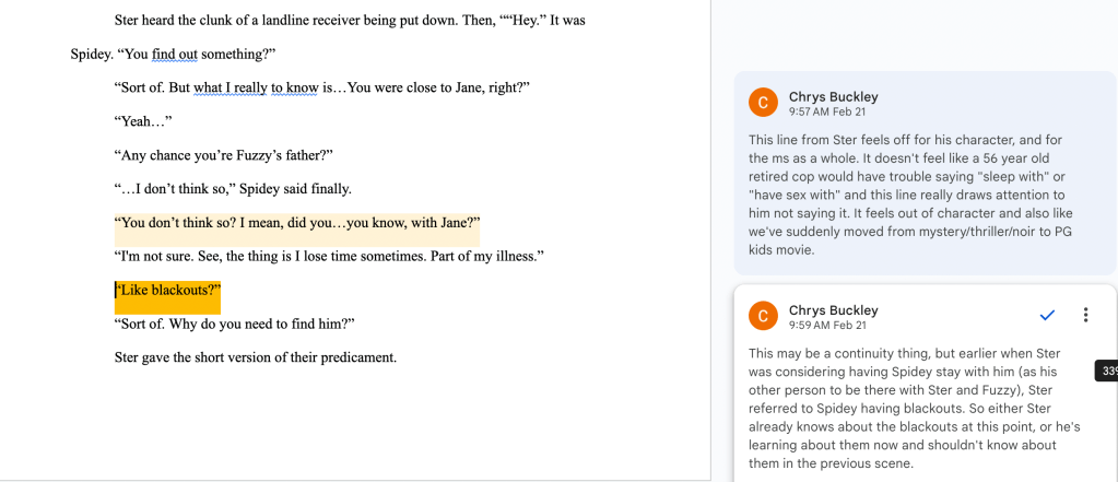
One of the foundational parts of my Literary Agents and Acquisitions class as part of the Book Publishing master’s program at Portland State University was learning to write Reader Reports.
A Reader Report is when someone reads a manuscript that’s been submitted to an agent or publisher and writes up an analysis. This report looks at the strengths and weakness of the story as well as how it fits in the market, then makes a recommendation for the publisher or agent to either accept or pass on the submission.
For this project, we were given the first 7000 words of a 63k-word original manuscript that was submitted to a literary agency. It was titled simply Untitled RomCom.
If you read my Reader Report and think, Hmm, this sounds oddly familiar, it’s because this was a draft from a real manuscript which was published as The Matzah Ball by Jean Meltzer. I figured that out while researching comparative titles for the market positioning portion of the Reader Report.
In my work at Ooligan Press, I get to work on so many books I’m so excited about, and this sample is from one of them.
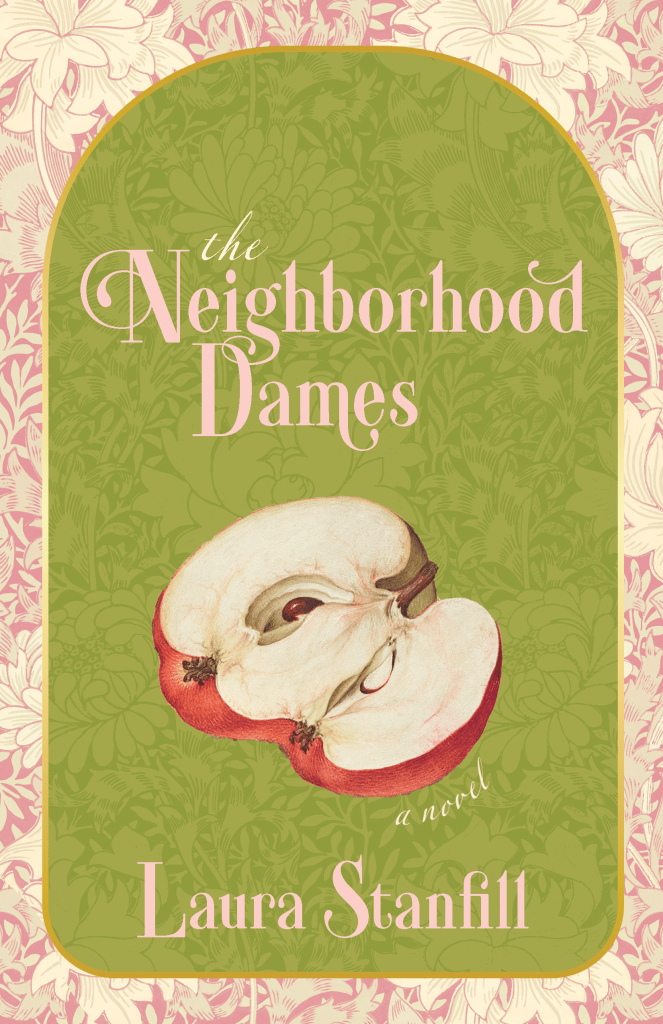
The Neighborhood Dames by Portland author and publisher Laura Stanfill (Forest Avenue Press) is a historical literary fiction novel that takes place in the Prohibition era. There are so many layers to this book—illicit cider, Tin Pan Alley, a friendship shaped by the times, neurodivergence, and literal dismantling of the patriarchy—and it’s written so well. When we were reading it for a pitch last academic year, I couldn’t put it down.
The Neighborhood Dames comes out November 10, 2026.
The copyedit of this book was one of the smoothest I ever took part in. I mostly just played hyphenation police and suggested a few word changes. It was a joy to work on such polished prose.
Here’s the cover, designed by my Ooligan Press colleague Kaitlyne Bozzone (@residentsapphic on IG), the manager of our Design department, who is always awesome to work with. Again, I did NOT design this, but wanted to include it for the visual element of the cover, as well as to plug Kaitlyne’s work!
It isn’t typical for authors to design their own books when they’re traditionally published, but with small presses, it sometimes happens. Invisible Violets is my debut book, and my publisher, Jill McCabe Johnson of Wandering Aengus Press, gave me the option to do the interior design and layout. Jill knew I’d done design work for Ooligan Press and for classes, and had checked out this Portfolio page before offering that option.
First, I designed my book interior as part of my Advanced Book Design class, the final design class in my grad program. The requirements for that were different from what my publisher needed, so I ended up with two versions.
The book interior for the class was in color, had to include images, and had to have an index. Though my book is a memoir in essays and might not seem like it lends itself to an index, I immediately knew mine would be a pop culture index, for all the song, album, TV show, band, book, poetry and movie references and allusions. At the time of this version, I didn’t have any blurbs yet and some things on the copyright page were TBD.
Here is a sampling of the glorious interior with images and including the excessive and obsessive index:
Then there was the real book, in black and white, without any images or index, and with the flower used as a section break marker (the technical term is “dinkus”) replaced by a more standard glyph. This version has real blurbs and the full copyright page.
In both versions, the type is larger than typical. I expected many of my readers would have low vision, so while I didn’t go full-on large print, I did up the type size. Both versions were a blast to design because there were all sorts of fun things like section breaks and footnotes and subheadings to design around.
Here is a sampling form the actual interior of the IRL book:
The best part of all of this—well, other than being able to control the layout of my book and obsess over every detail of design, knowing there are absolutely zero widows or orphans in my book and I like the look of all the pages—is that my publisher liked my work, and has hired me to do all the interiors at Wandering Aengus Press!
If you’re perusing this portfolio and know me as an author, you might recognize the book title in this portfolio entry as the title of my book.
Yes, I designed my own cover. Sort of kind of on accident. This post will be both portfolio samples and story.
My publisher, Jill McCabe Johnson of Wandering Aengus Press, offered me the option to design my own interior when the press acquired my manuscript. Jill knew I’d done some interior work for Ooligan Press, and also looked at the samples that were currently on this digital portfolio. I said yes immediately, as interior book design might be my happiest place in the publishing process and I wanted the creative control over how my book would look.
Then, last spring, I took the final book design class in my grad program in Book Publishing, Advanced Book Design. We each had to pick a book early in the term as our Main Book Project, either something in the public domain or something we had the rights to. Since I knew I’d be designing my interior, I asked the professor, Elaine Schumacher (she’s amazing), if I could just use my own book manuscript. She said yes.
That meant I had to design a lot of covers for it.
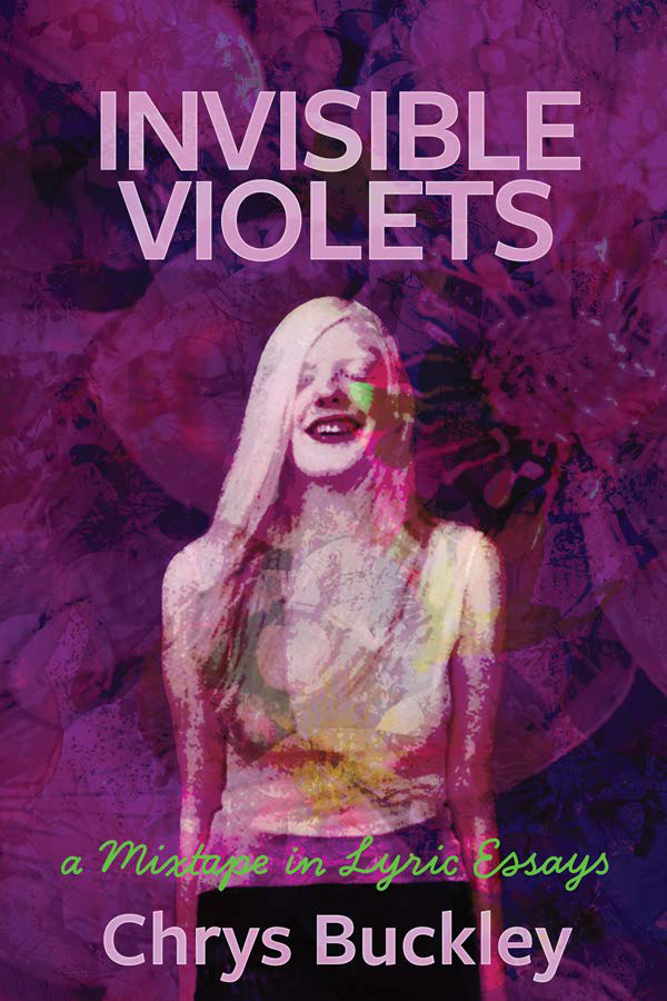
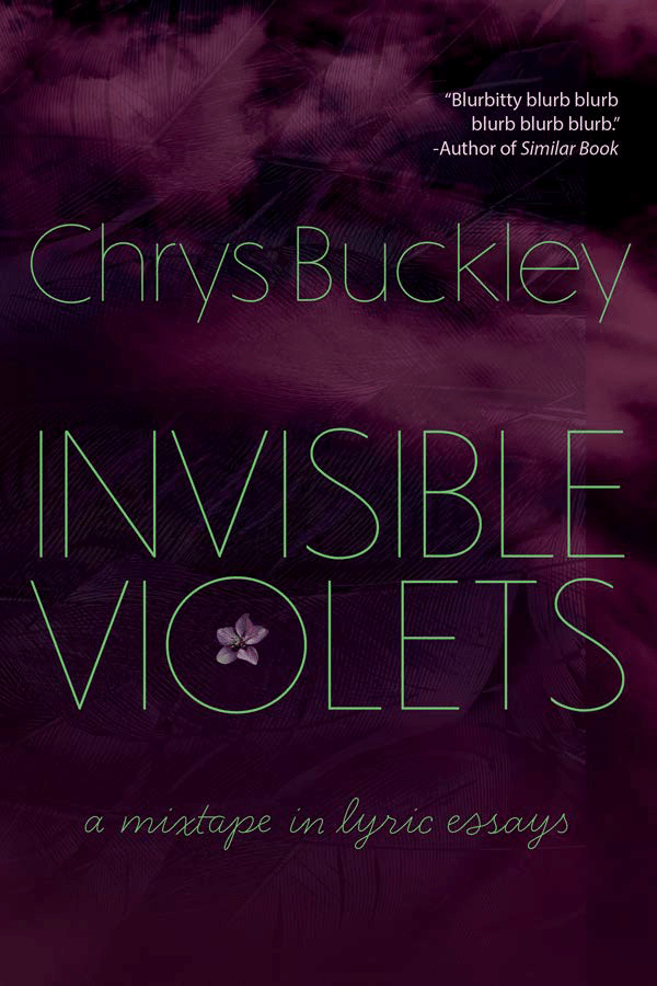
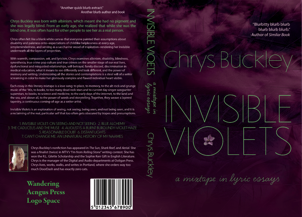
First were the image-based covers. From three mocked-up concepts, I had to develop one into a full jacket. For this one, I was sort of going for something that looked like an album cover. The picture of me was taken by Rick Guidotti of Positive Exposure. (He’s in the book, too.)
Here is the image-based cover and full jacket:
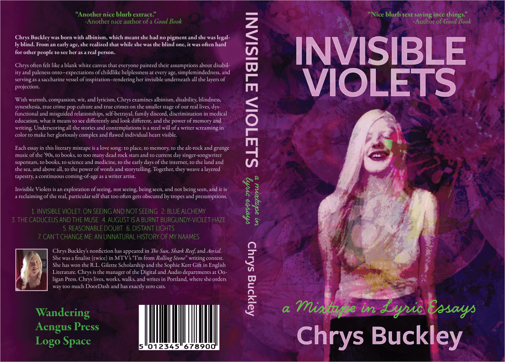
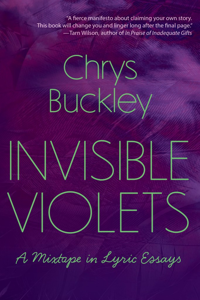
Then we went through the same process, but with typographic covers. We each came up with three concept mock-ups. From there, we had to develop one into a full jacket. This was less familiar territory for me, and just came from playing around with textures in Photoshop, using the tools I was learning in the class.
Here’s the cover and full jacket for the typographic cover:
While I was taking the class, Jill asked about ideas for cover designs, and I said I was having to design some for my grad program anyway, so I’d send her them when I was done. She could then see if she wanted to use either of them, or scrap both and start from scratch. Full disclosure: I expected her to scrap both. I’ve never thought of myself as a cover designer, even though I’ve had to do it for several classes, as evidenced throughout this portfolio.
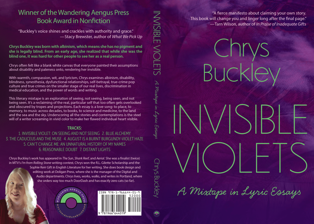
Jill chose to go with the typographic cover. Based on her feedback, as well as some lessons learned from printing a test copy (a requirement for the Advanced Book Design course), I made lots of adjustments and tweaks. Then, of course, we also swapped out real blurbs for my placeholders, and added the actual Wandering Aengus Press logos and real bar code.
Here is the final cover and jacket, what ended up on the actual book:
What this all means is that now my cover is the part of my book I feel the most insecure about. I’ve gotten a lot of compliments on it, though, mostly from people who have no idea I designed it myself. And my publisher wants me to do some jacket work for their press. And I like my cover, even when I feel insecure about how inexperienced a cover designer I am, so there’s also that.
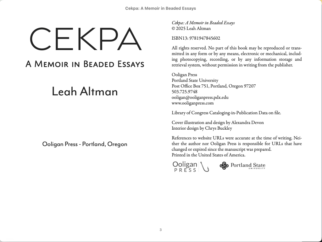
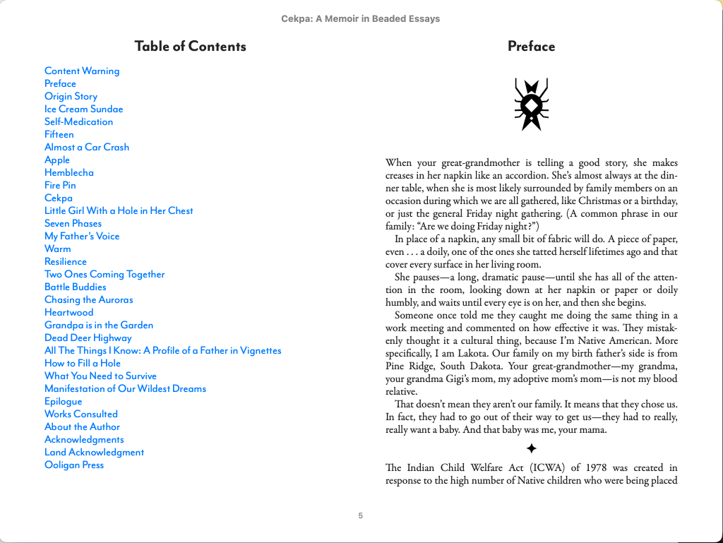
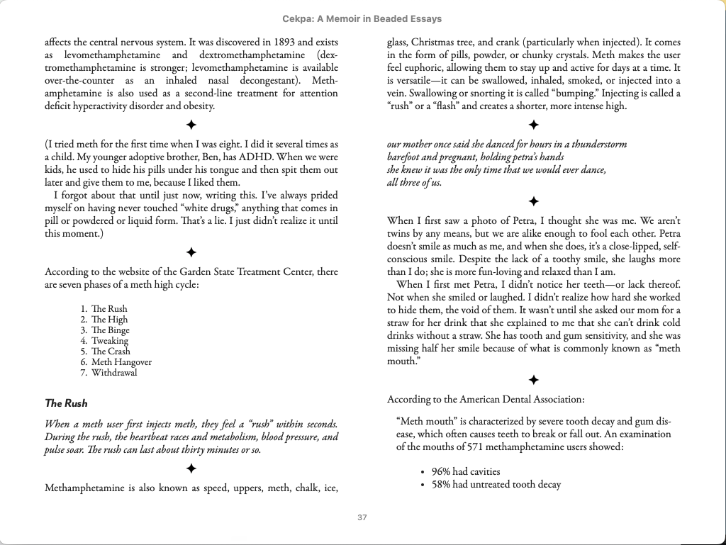
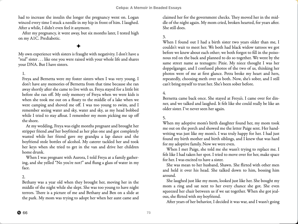
One of my first jobs as the manager of the Digital and Audio departments at Ooligan Press was to make a fully accessible ebook for Cekpa: A Memoir in Beaded Essays in advance of its release.
This is a little trickier to know how to display! Of course, for the full ebook experience, you can always purchase Cekpa on bookshop.org or any other bookselling website and choose the ebook version.
Since this fully accessible ebook is reflowable, its appearance will adjust to any changes in typeface, font size, or any other parameter that someone makes in their e-reader, so this is just one view.
Here are some images of the ebook in Apple Books:
This was a really fun project to work on, especially since I had already designed the Cekpa galley and then Cekpa‘s full interior. The ebook was the last phase of the process of producing the book. It was a real journey.
And I’m completely biased but this book is really good. I highly recommend it, whether you read it in print or ebook form!
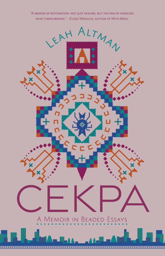
Here is the cover of Cekpa. It was designed by my Ooligan Press colleague Alex Devon, whose work you can see at mothinthemargins.wordpress.com! To be extra clear, this cover is NOT my work—I wish!—it’s here to add some visual flavor to the post, and as a chance to plug Alex’s work! Also, the book is really, really good and you should all read it!
Echoes of the Lost (publishing May 12, 2026) is one of the Ooligan Press books I’ve gotten to work on the most. In other parts of this portfolio, I did a Readers Report on Echoes, and then a Developmental Edit focused on character development for Echoes. It’s a testament to the story and the writing that I still can’t wait to read it in its final printed form when the book is released!
Then it was time for the copyedit, and I got my hands on both the heavy/medium round and then later the medium/light round, so I’m including samples of both.
Here’s a sampling of the heavier round of copyediting:
As you might notice, I like to point out when things are done well, and I make use of the comments even in a light CE, and I’m always tracking plot and continuity (see the comment on the last page in the light CE sample above).
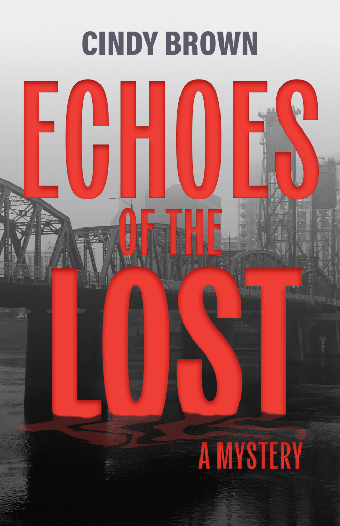
Here’s the cover, designed by my Ooligan Press colleague who taught me everything I know about ebooks, Madelynn Sare. Again, I did NOT design this, but wanted to include it for the visual element of the cover, as well as to plug Madelynn’s work!
There were a lot of things the final interior needed that the galley didn’t, like widow/orphan control. There were also several elements to the text of this book that would take some extra design finesse: poetry, bulleted lists, numbered lists, numbered lists with paragraphs within some of the items, text messages, quoted source material, vignettes, and the text reproduction of a funeral program.
In addition to the text elements, we decided during the interior design process to add a Lakota spider image as a chapter opening ornament, and a four-pointed star as the section break glyph (dinkus in design jargon). It was challenging as I was still fairly new to book design and hadn’t worked with images in these exact ways before, and it took some problem-solving, and I’m really pleased with and proud of the results.
Here is the cover of Cekpa. It was designed by my Ooligan Press colleague Alex Devon, whose work you can see at mothinthemargins.wordpress.com! To be extra clear, this cover is NOT my work—I wish!—it’s here to add some visual flavor to the post, and as a chance to plug Alex’s work! Also, the book is really, really good and you should all read it!
Instead of doing an intensive developmental editing process like the one in this portfolio piece, we were asked to focus on specific aspects of the manuscript, and write a letter in any form as long as it was under two pages. (Full length DE letters tend to be quite a bit longer.) My assigned focus was character development.
In addition to the letter, we were asked to mark up the full manuscript. I obviously can’t share the full marked up manuscript as that would be some serious copyright infringement and I really want everyone to go out and read this book when it comes out on May 12, 2026. So instead I’ll share some screenshots that are part of my Ooligan portfolio for the term.
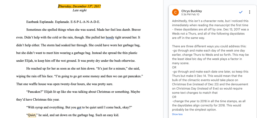
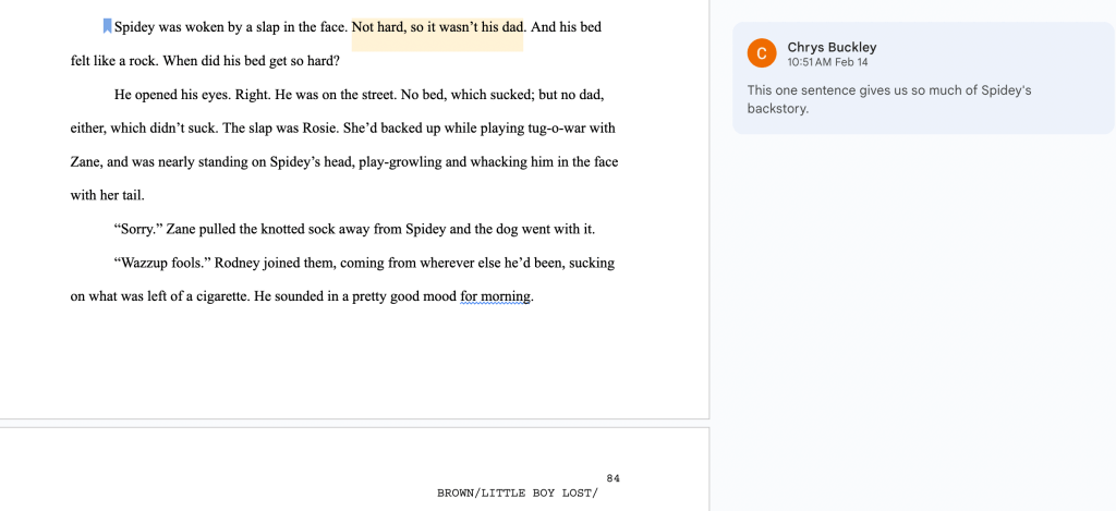
Manuscript Markup Screenshots:
These images each highlight different aspects of the DE markup.
Well, the first one actually wasn’t technically on topic of character development, but I felt it was so me I couldn’t not include it. My memory is weirdly great for dates and days of the week, and I clocked the mismatch immediately. (And while you might think that I automatically knew that Dec 13th in 2017 was a Wednesday because that’s Taylor Swift’s birthday and I’m a crazy enough Swiftie to have an encyclopedic memory for what day her birthday fell on every year, and that wouldn’t be an unreasonable assumption, but in this case the date and day registered right away as not right because my med school interview at the Mayo Clinic was Dec 15th, 2017 and it was a Friday.) Of course, I checked a calendar first before making this comment. Another reason I wanted to share this one was that we’re taught that, when possible, we should give multiple options for how an author can address feedback, and this one lays out three options to get this date/day (and all subsequent ones in the manuscript) back on track.
You can always count on me to catch timing discrepancies big and small!
I included the second one because part of my style as a DE is to make sure I’m not just pointing out what could be better but also what is already great. The third and fourth photos demonstrate the typical feedback I give in DE manuscript markup.
Here’s the cover, designed by my Ooligan Press colleague who taught me everything I know about ebooks, Madelynn Sare. Again, I did NOT design this, but wanted to include it for the visual element of the cover, as well as to plug Madelynn’s work!
A galley is what is sent to people to blurb or review the book prior to publication. The design process for a galley is much more loose than it is for a final interior. Widows and orphans and runts are allowed, some front or back matter may not be included or finalized, and the fonts in the interior won’t have much at all to do with the eventual cover fonts, because a galley can be started and finished before a cover is finalized.
Here’s a representative sampling of my work on the Cekpa galley interior:
Here is the cover of Cekpa, in case you’re interested. It was designed by my Ooligan Press colleague Alex Devon, whose work you can see at mothinthemargins.wordpress.com! To be extra clear, this cover is NOT my work—I wish!—it’s here to add some visual flavor to the post, and as a chance to plug Alex’s work! Also, the book is really, really good and you should all read it!
The final project for WR 571 Typography, Layout, and Production was to re-design From Knowledge to Power (K2P), published by Ooligan Press in 2021. We worked with the first three chapters.
The biggest challenge with designing this book was that it contains several illustrations, color plates, images, and boxes. (There are also tables, but we didn’t have access to those.) Working on this project was good practice in working with an image-heavy, footnote-laden text, and using grids in InDesign.
Cover design isn’t my specialty—book interiors are!—but here’s my cover:
Fun fact. Some of you may know that I did my undergrad in Biochemistry at Portland State, and back in that life, not only did I take a handful of classes from K2P’s author, John Perona, I also did research in his lab for two years. While I was never good at bioinformatics research, I did then and always will have great respect for John, his teaching, and his passion for climate change education. I have fond memories of attending his climate talks at the Kennedy School back when I worked in his lab, and those talks eventually became this book. So, I feel an extra layer of connection to K2P.
With no further ado, here’s a sampling of the interior. I’m including the front matter as well as some representative pages of the interior that demonstrate my work with illustrations, boxed text, photographs, and footnotes.