Invisible Violets – Essay Collection Covers – Image-Based and Typographic

If you’re perusing this portfolio and know me as an author, you might recognize the book title in this portfolio entry as the title of my book.

Yes, I designed my own cover. Sort of kind of on accident. This post will be both portfolio samples and story.

My publisher, Jill McCabe Johnson of Wandering Aengus Press, offered me the option to design my own interior when the press acquired my manuscript. Jill knew I’d done some interior work for Ooligan Press, and also looked at the samples that were currently on this digital portfolio. I said yes immediately, as interior book design might be my happiest place in the publishing process and I wanted the creative control over how my book would look.

So, I was always going to design my interior (read about the process and see samples here). I never imagined I’d design my cover.

Then, last spring, I took the final book design class in my grad program in Book Publishing, Advanced Book Design. We each had to pick a book early in the term as our Main Book Project, either something in the public domain or something we had the rights to. Since I knew I’d be designing my interior, I asked the professor, Elaine Schumacher (she’s amazing), if I could just use my own book manuscript. She said yes.

That meant I had to design a lot of covers for it.

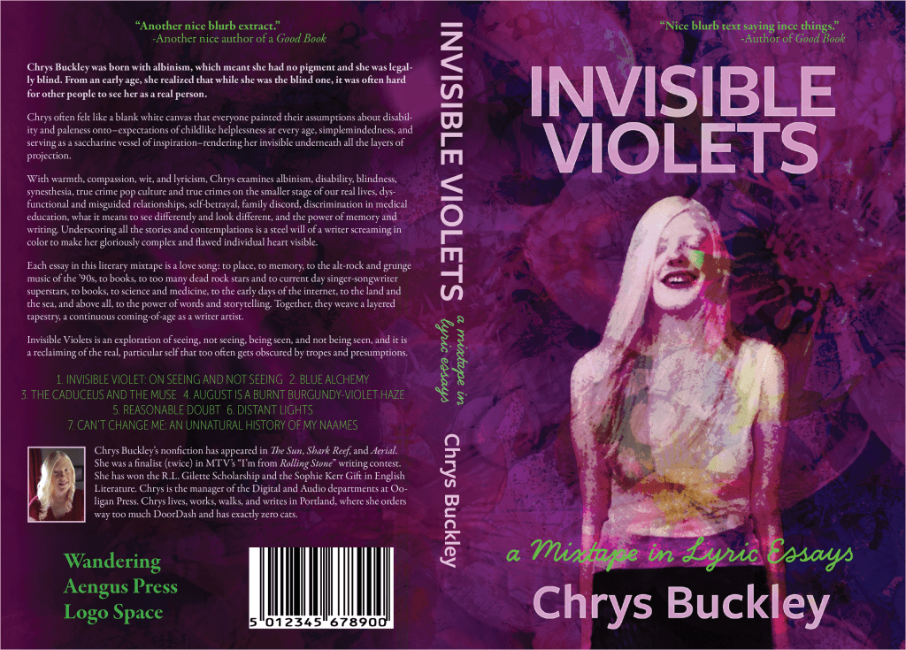
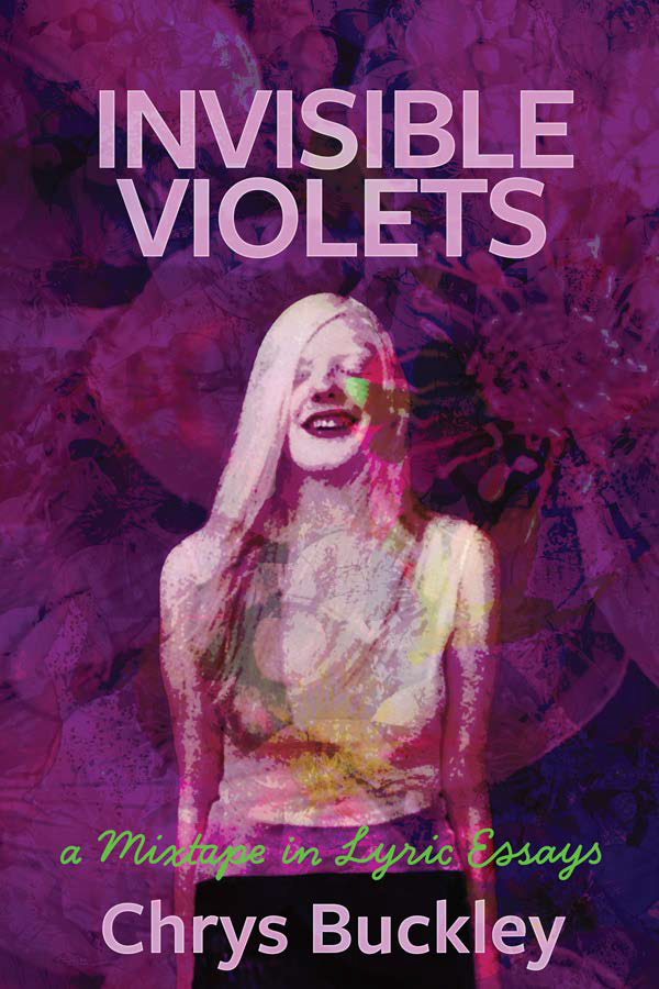
First were the image-based covers. From three mocked-up concepts, I had to develop one into a full jacket. For this one, I was sort of going for something that looked like an album cover. The picture of me was taken by Rick Guidotti of Positive Exposure. (He’s in the book, too.)

Here is the image-based cover and full jacket:
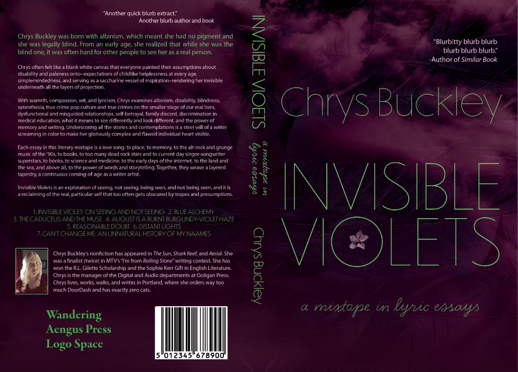
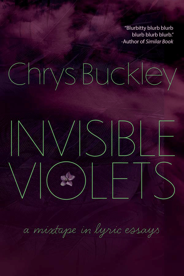
Then we went through the same process, but with typographic covers. We each came up with three concept mock-ups. From there, we had to develop one into a full jacket. This was less familiar territory for me, and just came from playing around with textures in Photoshop, using the tools I was learning in the class.

Here’s the cover and full jacket for the typographic cover:
While I was taking the class, Jill asked about ideas for cover designs, and I said I was having to design some for my grad program anyway, so I’d send her them when I was done. She could then see if she wanted to use either of them, or scrap both and start from scratch. Full disclosure: I expected her to scrap both. I’ve never thought of myself as a cover designer, even though I’ve had to do it for several classes, as evidenced throughout this portfolio.

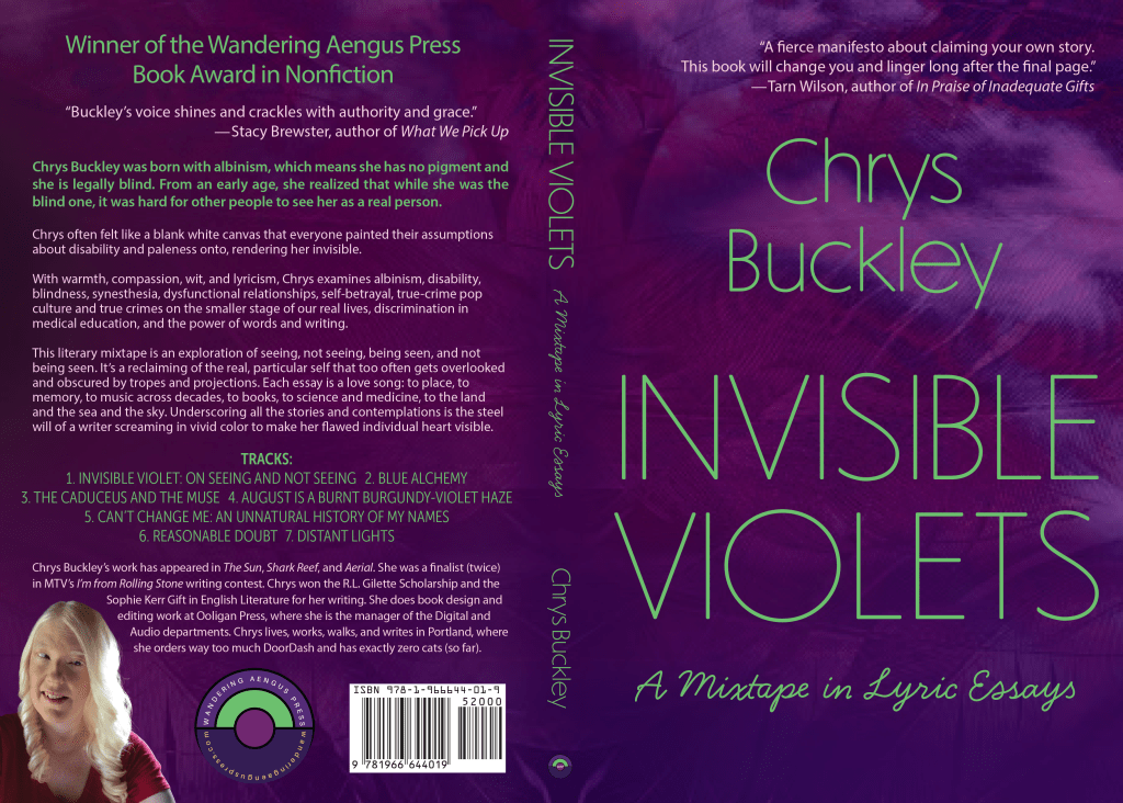
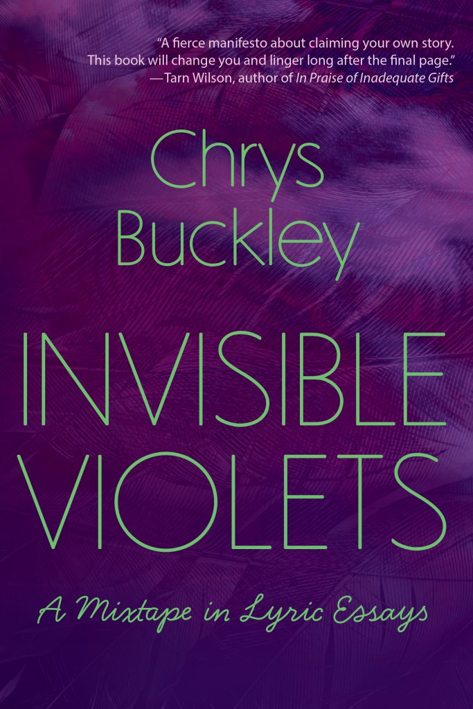
Jill chose to go with the typographic cover. Based on her feedback, as well as some lessons learned from printing a test copy (a requirement for the Advanced Book Design course), I made lots of adjustments and tweaks. Then, of course, we also swapped out real blurbs for my placeholders, and added the actual Wandering Aengus Press logos and real bar code.

Here is the final cover and jacket, what ended up on the actual book:
What this all means is that now my cover is the part of my book I feel the most insecure about. I’ve gotten a lot of compliments on it, though, mostly from people who have no idea I designed it myself. And my publisher wants me to do some jacket work for their press. And I like my cover, even when I feel insecure about how inexperienced a cover designer I am, so there’s also that.

From Knowledge to Power – Illustrated Nonfiction Interior Layout and Design and Cover Jacket

The final project for WR 571 Typography, Layout, and Production was to re-design From Knowledge to Power (K2P), published by Ooligan Press in 2021. We worked with the first three chapters.

The biggest challenge with designing this book was that it contains several illustrations, color plates, images, and boxes. (There are also tables, but we didn’t have access to those.) Working on this project was good practice in working with an image-heavy, footnote-laden text, and using grids in InDesign.

Cover design isn’t my specialty—book interiors are!—but here’s my cover:

Fun fact. Some of you may know that I did my undergrad in Biochemistry at Portland State, and back in that life, not only did I take a handful of classes from K2P’s author, John Perona, I also did research in his lab for two years. While I was never good at bioinformatics research, I did then and always will have great respect for John, his teaching, and his passion for climate change education. I have fond memories of attending his climate talks at the Kennedy School back when I worked in his lab, and those talks eventually became this book. So, I feel an extra layer of connection to K2P.

With no further ado, here’s a sampling of the interior. I’m including the front matter as well as some representative pages of the interior that demonstrate my work with illustrations, boxed text, photographs, and footnotes.

Frankenstein – Fiction Interior Layout and Book Design and Cover Jacket

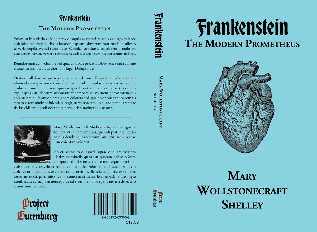
For WR 571 Typography, Layout, and Production, we worked with the Project Gutenberg version of Frankenstein.

For this project, I designed both a cover and an interior. I’m no cover designer, but I’ll share mine anyway:

As for the interior, we were only tasked with designing the first five chapters of Frankenstein, but I got a bit obsessive and did the whole book.

Since I can’t seem to post anything without mentioning music, I must say that every time my professor mentioned the first five chapters of Frankenstein, I thought of The National’s album The First Two Pages of Frankenstein. Listen on Apple Music while perusing this lengthy interior.

One of the biggest design challenges was that large portions of the book, both entire chapters and sections within chapters, are comprised of letters. I wanted them to stand out from the rest of the text, but also to be readable, especially considering their lengths.

Distant Lights Chapbook – Longform Personal Essay Layout and Interior Design and Cover Jacket

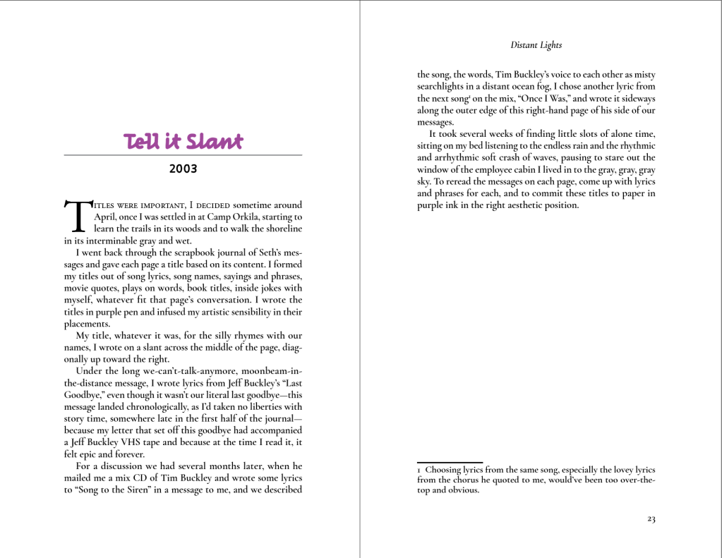
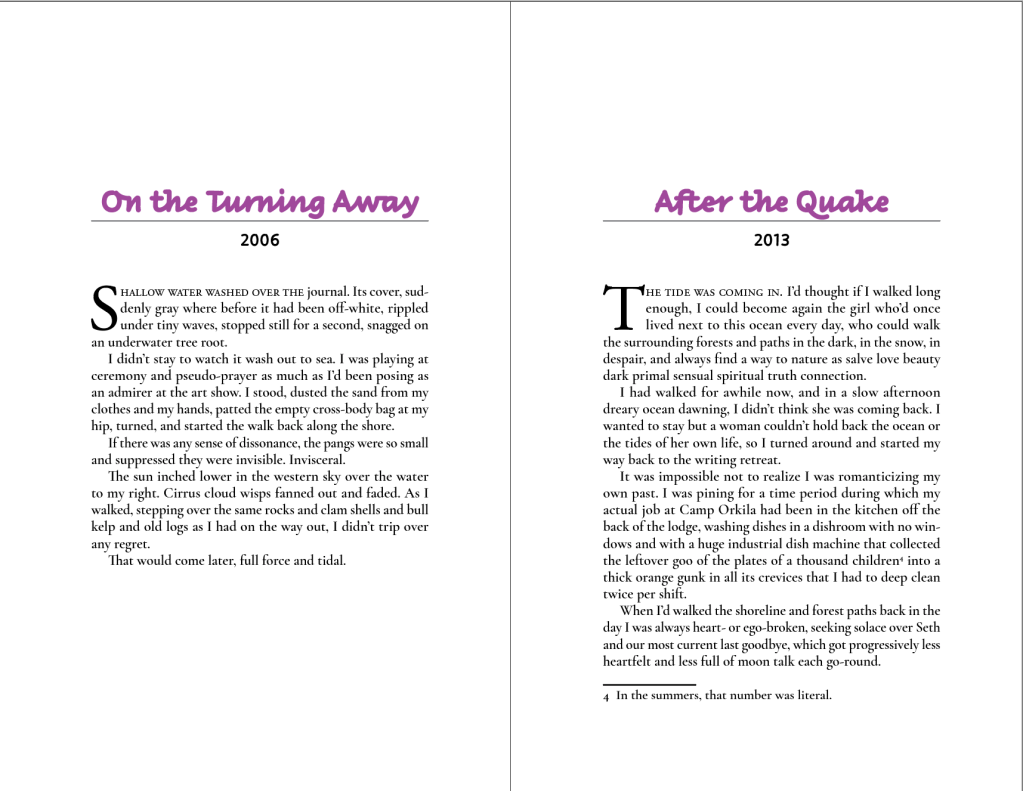
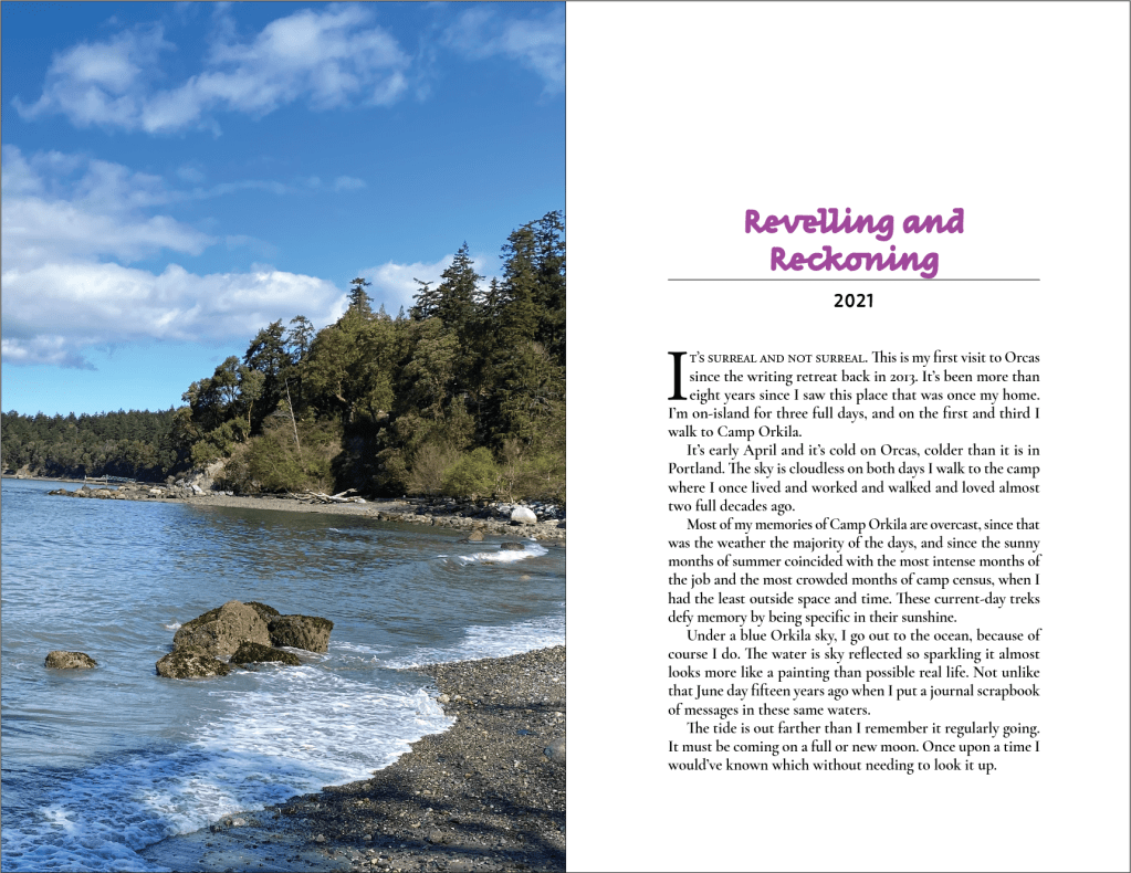
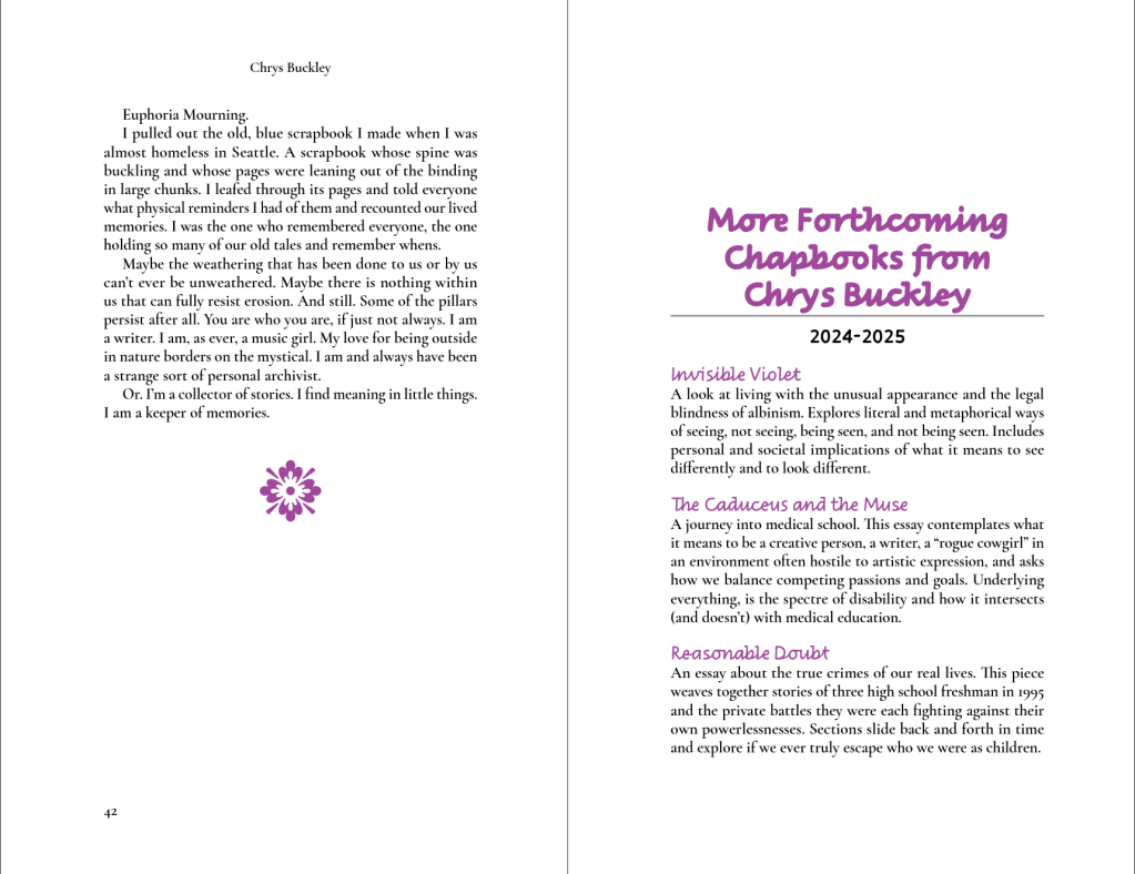
This was my final project for WR 562 Book Design Software. We each had to design a chapbook. I decided to layout one of my personal essays. I chose this one, “Distant Lights,” because it had the most opportunities for design practice: sections that I could make into chapters in a chapbook, section breaks within the chapters, footnotes, and photos.

This essay features several mentions of the album Euphoria Morning by Chris Cornell (originally titled Euphoria Mourning), so feel free to listen to Euphoria Morning on Apple Music as you look through this portfolio project.

Because this is my original, unpublished writing that delves into deeply personal topics, I will share a photo of my cover design and selected photos of the interior, but won’t share the full text.

UPDATE: This essay is part of my debut collection, INVISIBLE VIOLETS: A Mixtape in Lyric Essays, available on March 13, 2026.

Cover:

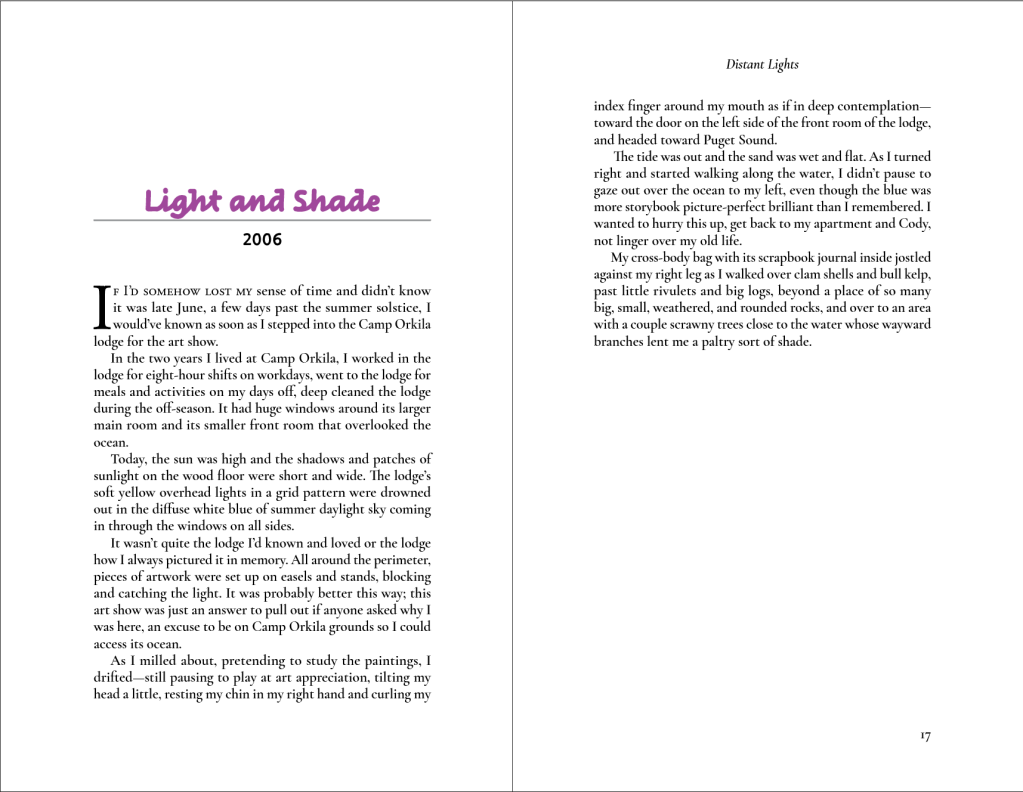
Samples from the Interior:

Because I intended to print some copies of my chapbook, using InDesign’s “Print Booklet” feature, I needed a page count divisible by 4 (or divisible by 4 minus 1 if I wanted a blank last verso page), I added this extra page advertising future chapbooks.

And here is an iPhone photo of the printed version: