This project, a galley for Cekpa: A Memoir in Beaded Essays by Leah Altman, published in November 2025, was part of my work at Ooligan Press.
A galley is what is sent to people to blurb or review the book prior to publication. The design process for a galley is much more loose than it is for a final interior. Widows and orphans and runts are allowed, some front or back matter may not be included or finalized, and the fonts in the interior won’t have much at all to do with the eventual cover fonts, because a galley can be started and finished before a cover is finalized.
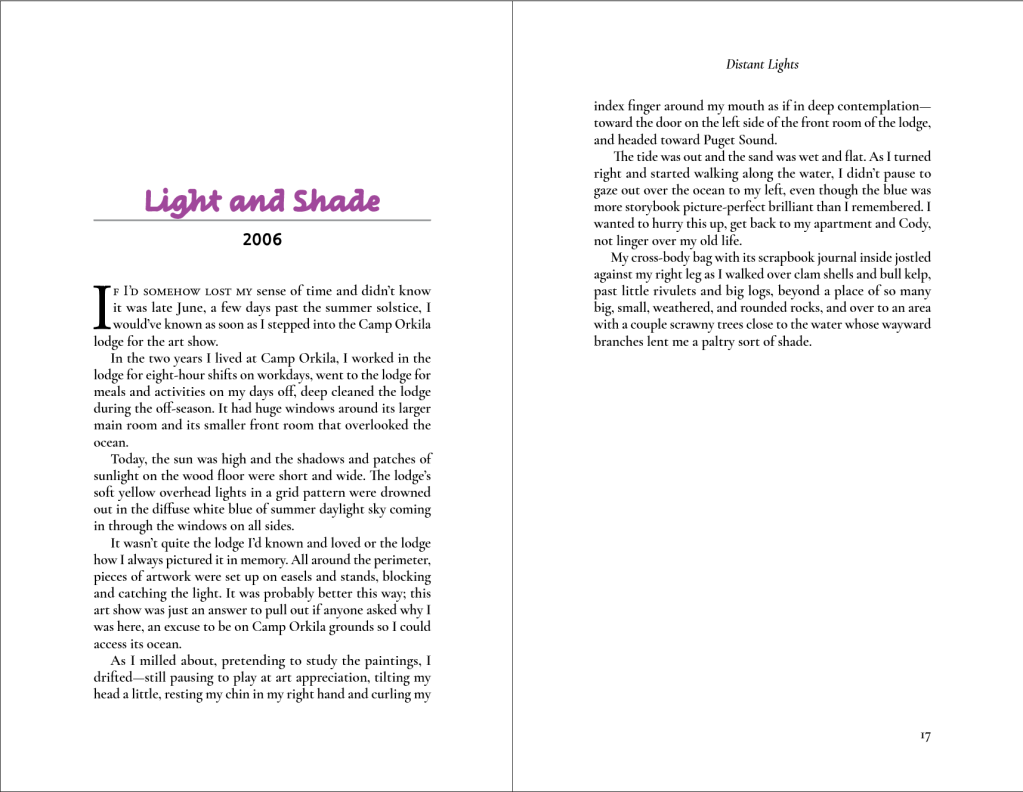
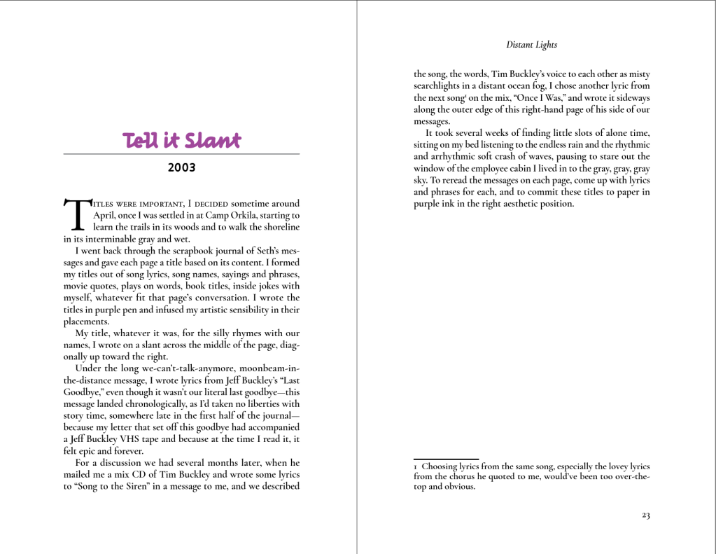
Here’s a representative sampling of my work on the Cekpa galley interior:
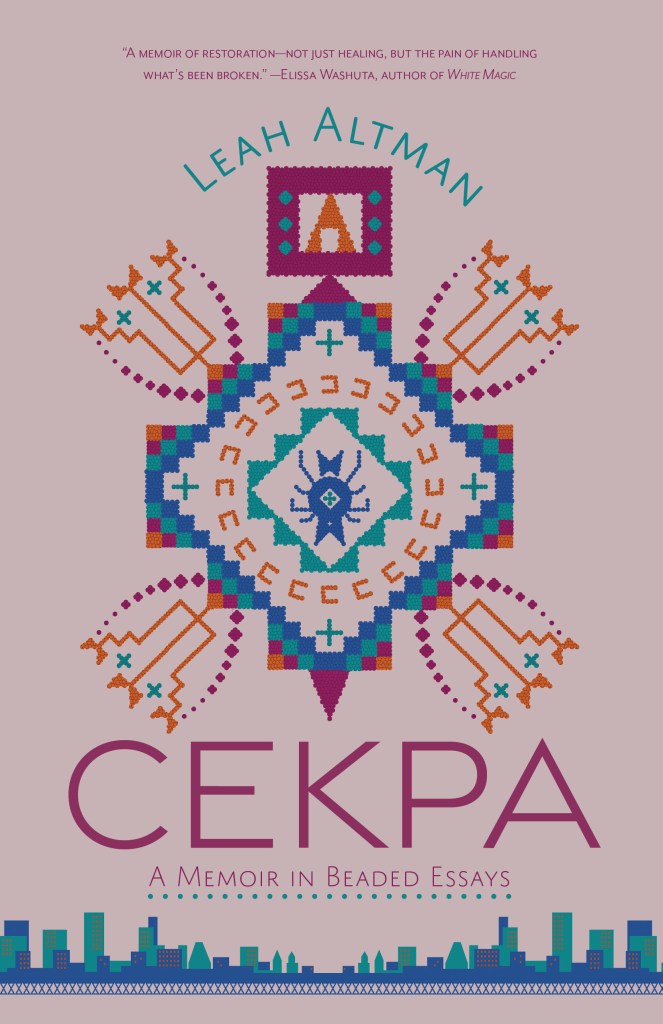
Here is the cover of Cekpa, in case you’re interested. It was designed by my Ooligan Press colleague Alex Devon, whose work you can see at mothinthemargins.wordpress.com! To be extra clear, this cover is NOT my work—I wish!—it’s here to add some visual flavor to the post, and as a chance to plug Alex’s work! Also, the book is really, really good and you should all read it!